
Every action should produce an immediate, informative response so people know what happened, whether it worked, and what to do next.
Overview
Feedback is the system’s reply to what a person does. Pressing an elevator button lights it up. Clicking Save shows “Saved.” Submitting a form either confirms success or explains what needs fixing. Without feedback, people are left guessing, and they tend to repeat actions, abandon tasks, or assume the system is broken.
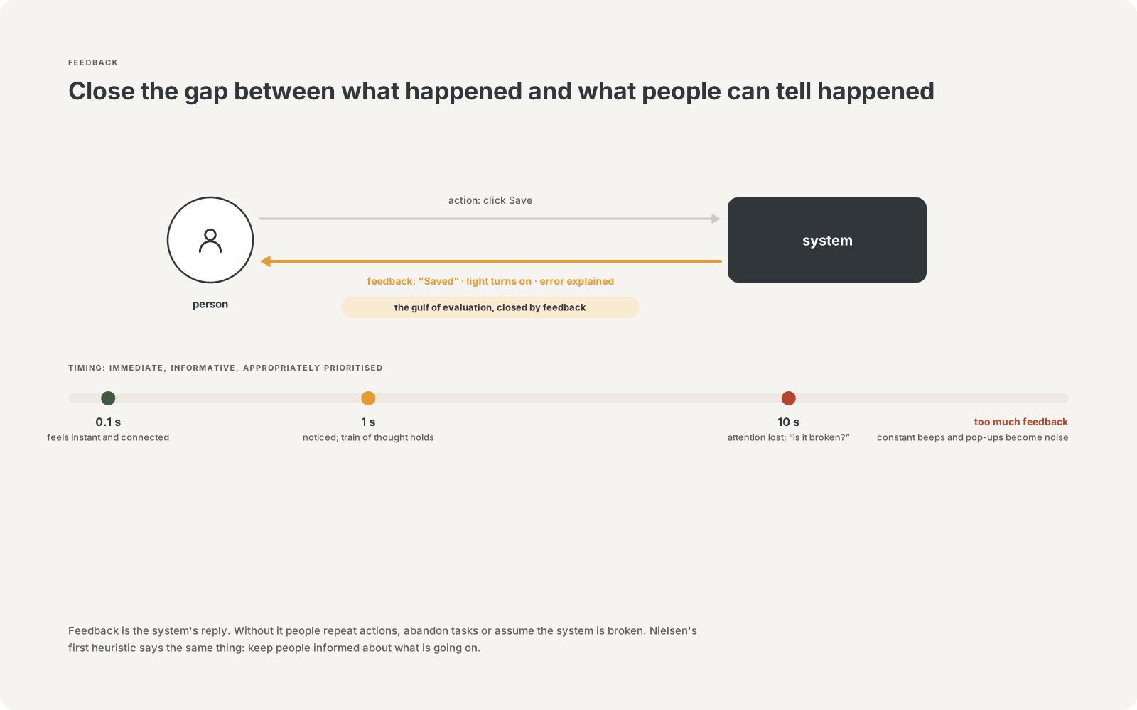
Norman describes effective feedback as immediate, informative, and appropriately prioritized. Even a delay of a tenth of a second can feel disconnected; too much feedback, such as constant beeps or pop-ups, becomes noise that people learn to ignore.[1]
Feedback closes what Norman calls the gulf of evaluation: the gap between what the system did and what the person can tell it did.[6][7] Jakob Nielsen made the same idea the first of his ten usability heuristics: visibility of system status.[2][3]
Why it matters
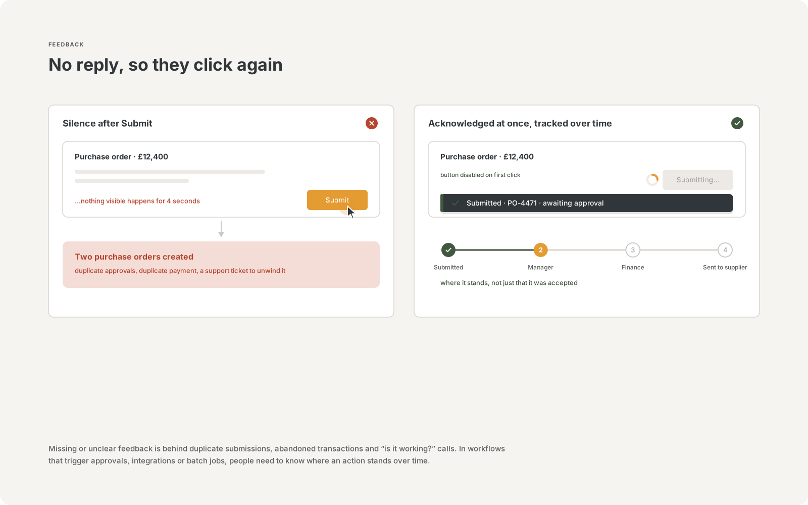
Missing or unclear feedback is one of the most common causes of duplicate submissions, abandoned transactions, and “is it working?” support calls. In enterprise workflows where actions trigger approvals, integrations, or batch jobs, people need to know not only that an action was accepted, but where it stands over time.
Clear feedback also builds trust. Systems that consistently confirm actions and explain failures feel reliable, even when things go wrong.
Key takeaways
- Respond immediately. About 0.1 seconds feels instantaneous; about 1 second keeps a person’s train of thought; beyond about 10 seconds, attention drifts and people need a progress indicator.[4][5]
- Match feedback to the wait. Use a subtle state change for instant actions, a spinner or skeleton screen for short waits, and a percent-done indicator or status tracker for long or multi-step processes.[5][9]
- Be specific. “Your request was submitted and is awaiting manager approval” is far more useful than “Success.”
- Make errors helpful. Explain what went wrong in plain language, where it happened, and how to fix it. Never blame the user.[8]
- Prioritize. Not every event deserves an interruption. Reserve modal alerts for things that truly need attention now.
- Make status accessible. Status messages should be announced to screen-reader users without moving their focus.[10]
In practice
Common patterns in business applications, portals, and internal tools:
Supports the principle | Undermines the principle |
|---|---|
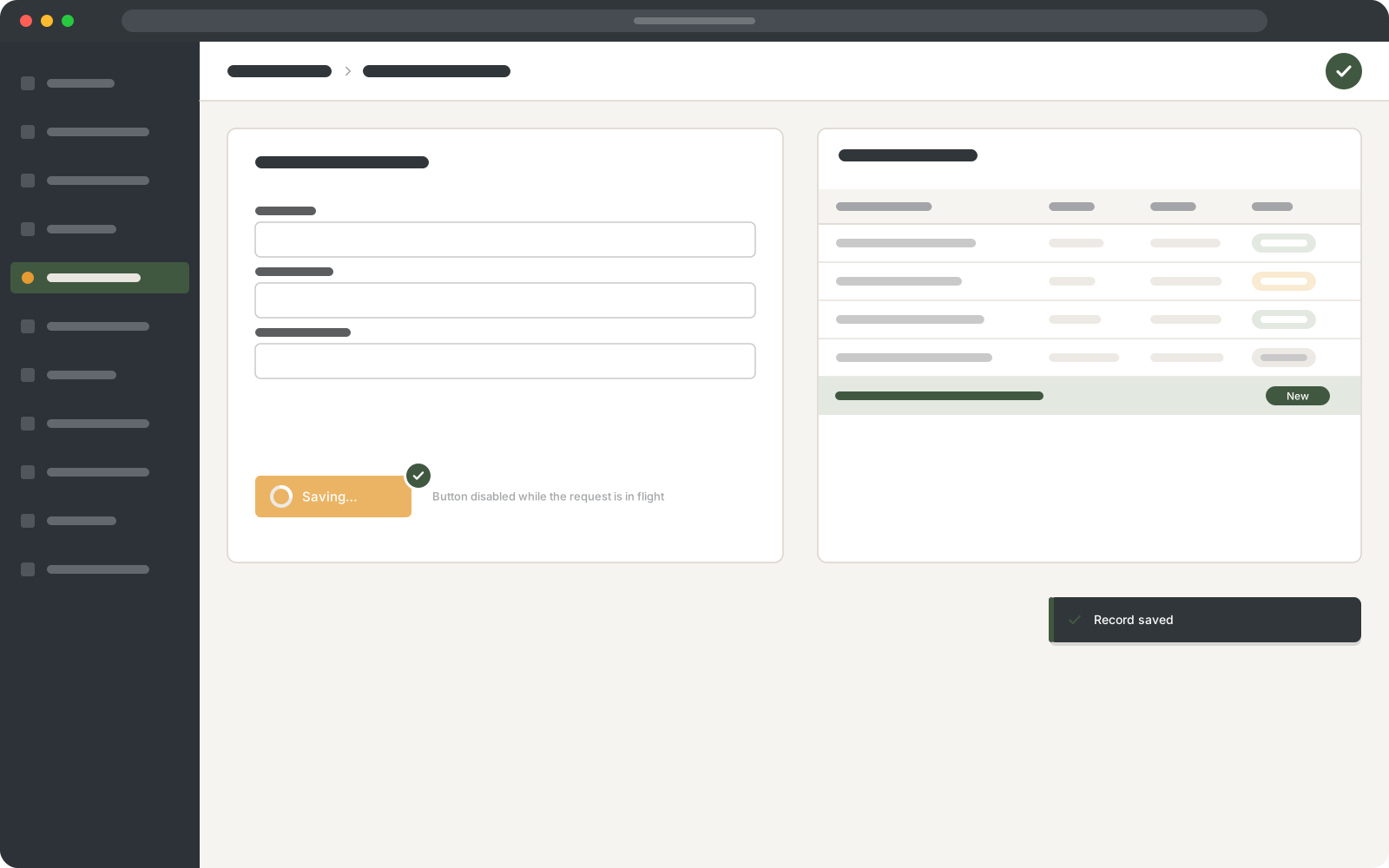
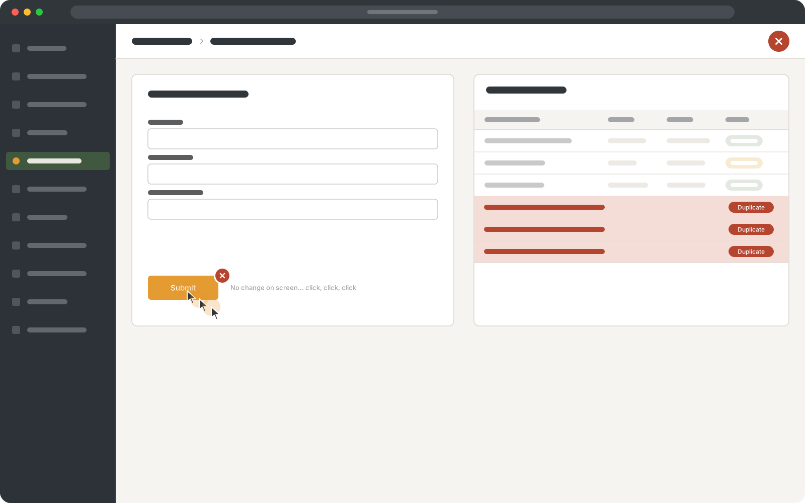
Buttons show a pressed or loading state and are protected against double submission. | Clicking Submit with no visible change, so people click again and create duplicates. |
Inline validation explains the problem next to the field (“Enter a date after the start date”). | A generic “An error occurred” banner at the top of a long form. |
Long-running jobs show progress and send a notification when complete. | A spinner that runs indefinitely with no indication of progress or expected time. |
Saved changes are confirmed with a brief, non-blocking message. | Modal “OK” dialogs for routine confirmations. |
Workflow records show their current status and history (submitted, in review, approved). | Requests that disappear into a queue with no visible status. |
Questions to ask in a design review
- After each action on this screen, how does the person know it worked?
- What happens if the action takes 5 seconds? 30 seconds? 5 minutes?
- When something fails, does the message say what went wrong and what to do next?
- Are we interrupting people with feedback they do not need?
Origin
The idea of feedback as a control loop comes from engineering and cybernetics, formalized by Norbert Wiener in 1948.[11] In human-computer interaction, Robert Miller’s 1968 study of response times in conversational computing established that the timing of a system’s reply shapes how people experience it.[4]
Hutchins, Hollan, and Norman described the gulf of evaluation in 1985,[6] and Norman made feedback one of his fundamental principles of interaction in The Design of Everyday Things.[1] Jakob Nielsen’s 1994 heuristics, still the most widely used checklist for usability reviews, list visibility of system status first.[2]
Related concepts
- Doherty Threshold — productivity rises when systems respond in under 400 milliseconds
- Signifiers — state changes are a form of feedback
- Zeigarnik Effect — people remember unfinished tasks, so show progress
- Peak-End Rule — how an experience ends shapes how it is remembered
- Goal-Gradient Effect — visible progress motivates people to finish
- Constraints — preventing errors reduces the need for error feedback
References and further reading
- Norman, D. A. (2013). The Design of Everyday Things: Revised and Expanded Edition. Basic Books. (Originally published 1988 as The Psychology of Everyday Things.) https://en.wikipedia.org/wiki/The_Design_of_Everyday_Things
- Nielsen Norman Group. 10 Usability Heuristics for User Interface Design. https://www.nngroup.com/articles/ten-usability-heuristics/
- Nielsen Norman Group. Visibility of System Status. https://www.nngroup.com/articles/visibility-system-status/
- Miller, R. B. (1968). Response Time in Man-Computer Conversational Transactions. AFIPS Fall Joint Computer Conference. https://dl.acm.org/doi/10.1145/1476589.1476628
- Nielsen Norman Group. Response Time Limits. https://www.nngroup.com/articles/response-times-3-important-limits/
- Hutchins, E. L., Hollan, J. D., and Norman, D. A. (1985). Direct Manipulation Interfaces. Human-Computer Interaction, 1(4). https://doi.org/10.1207/s15327051hci0104_2
- Nielsen Norman Group. The Two UX Gulfs: Evaluation and Execution. https://www.nngroup.com/articles/two-ux-gulfs-evaluation-execution/
- Nielsen Norman Group. Error-Message Guidelines. https://www.nngroup.com/articles/error-message-guidelines/
- Nielsen Norman Group. Progress Indicators Make a Slow System Less Insufferable. https://www.nngroup.com/articles/progress-indicators/
- W3C. Understanding WCAG 2.2 Success Criterion 4.1.3: Status Messages. https://www.w3.org/WAI/WCAG22/Understanding/status-messages.html
- Wiener, N. (1948). Cybernetics: Or Control and Communication in the Animal and the Machine. https://en.wikipedia.org/wiki/Cybernetics:_Or_Control_and_Communication_in_the_Animal_and_the_Machine
- Nielsen Norman Group. Indicators, Validations, and Notifications: Pick the Correct Communication Option. https://www.nngroup.com/articles/indicators-validations-notifications/
- Apple. Human Interface Guidelines: Feedback. https://developer.apple.com/design/human-interface-guidelines/feedback
- Yablonski, J. Laws of UX (format inspiration for this series). https://lawsofux.com/